
A Trades Marketplace
Built for Women
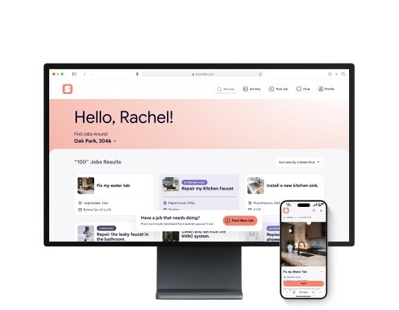
SheTrades is a two-sided marketplace that gives women a safer, more trustworthy way to book home services, and gives female tradespeople a platform built around them instead of one retrofitted for them. Rather than treating trust as a policy footnote, the product treats it as the core interface problem to solve.
The platform helps users:
Many women don't feel comfortable having an unfamiliar man alone in their home for trade work.
This is especially true for women living alone, elderly women, and mothers home alone with children. At the same time, women working in the trades have far thinner referral networks than men, making it harder for them to find consistent work.
This creates a few problems:
The goal was to design a marketplace where trust isn't just implied, it's visible in the interface itself, from verified profiles to transparent reviews, so users feel safe from the first search.
The primary users are women who want more control and comfort over who enters their home for trade work.
They may include:
On the supply side, the same platform serves female tradespeople looking for a channel that doesn't rely on personal referrals to find consistent work.
Designing for both sides meant the interface had to build trust for the person booking, while still making it easy for the tradesperson to look credible and get discovered.
I approached this as translating a business strategy into an interface that people could actually trust and use.
Problem framing
I started from a Lean Canvas mapping the target users, value proposition, and unfair advantage, and translated it into user-facing design problems rather than business ones.
Persona mapping
I broke the customer segments down into concrete personas, from women living alone to elderly homeowners and property investors, to design for their specific comfort and trust needs.
Trust-first interface planning
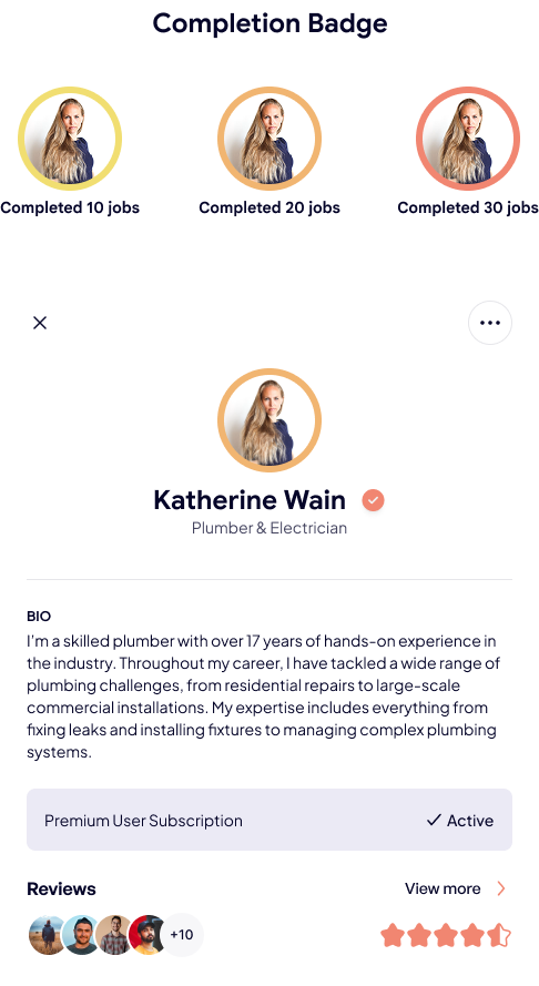
I identified where trust needed to be visible in the UI: verified badges, reviews, identity checks, and job history, so safety wasn't just a claim.
Engagement mechanic design
I treated the "digital badge" social-proof idea from the strategy doc as a real design problem: how to turn a booking into something worth sharing.
Two-sided balancing
I weighed every decision against both sides of the marketplace: the person booking, and the tradesperson trying to be found.
I began by grounding the design in the two sides of the marketplace: the person booking a job, and the tradesperson completing it.
For the booking side, I focused on making trust visible immediately, search results needed to show verification status and reviews without extra taps. For the tradesperson side, I focused on a portfolio-style profile that could make their work credible at a glance.
One of the most interesting parts of the project was the social-proof mechanic.
The original strategy included a "digital badge", a shareable stat like "I've spent $4,200 supporting women in trades this year." I treated this as a genuine engagement and retention problem: how do you turn a completed booking into something a user wants to share, without it feeling like a marketing gimmick bolted onto the product.
I also thought through onboarding moments that use real user stories, like featuring tradeswomen who are underrepresented in their field, as a way to build trust and community feeling directly inside the product, not just in outside marketing.
For the visual direction, I paired the brand's coral as the primary accent with a soft blush background and dark, near-black text, keeping the product warm and human rather than clinical.
Primary
#F18671
Secondary
#FFFFFF
Tertiary
#1C1C1C
To keep the interface approachable rather than corporate, I focused on:
The goal was to make the product feel warm and community-driven, reflecting a female-founded brand, while staying clean and easy to scan.
The biggest insight was that trust needed to be a search-result-level decision, not a profile-page-level one.
If users have to click into a profile to find out whether someone is verified, the platform has already lost the moment where trust actually matters.
Another insight was that the supply side needed its own kind of confidence-building, not just the demand side.
Female tradespeople needed a way to look credible fast, through portfolio-style profiles, since they don't have the years-long referral networks their male counterparts often rely on.
These insights shaped the design decisions:
These insights helped shape SheTrades into a product that supports both safety and discoverability at once.
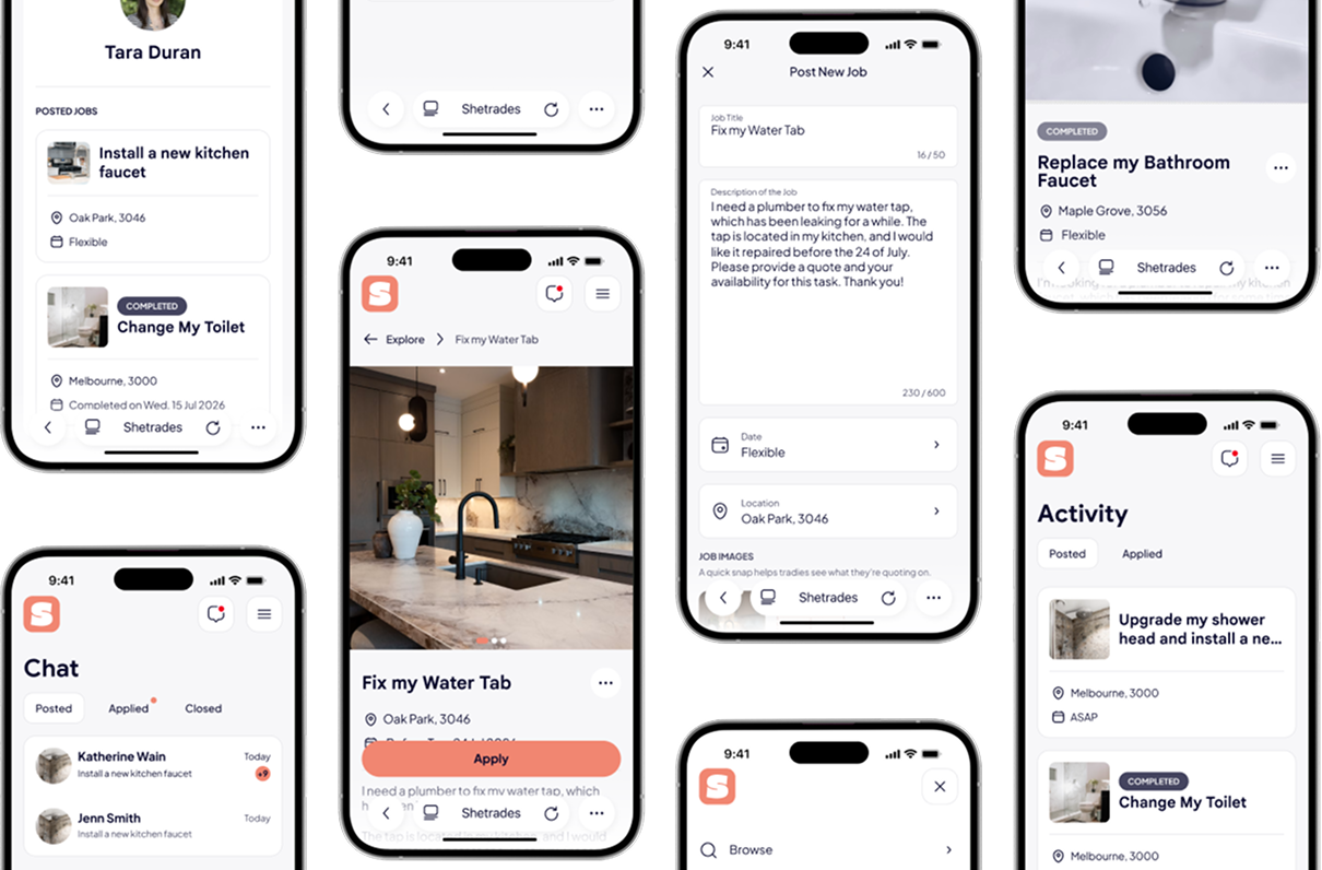
The solution is a two-sided web marketplace that makes trust visible at every step, from search to booking to review.
SheTrades allows users to:
The verification and review system became the core of the product, it's what turns a directory into something people actually feel safe using.
The result is a platform where safety is a product feature, not a footnote, designed to work equally well on desktop and mobile since it's used in the moment a problem comes up at home.
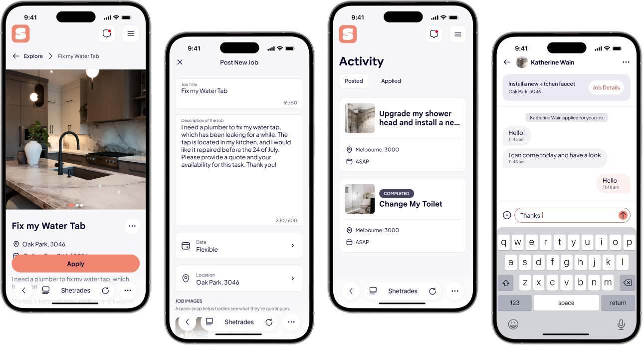
The result is a marketplace that treats safety and visibility as core product features, not afterthoughts.
The design helps:
It reframes booking a home service from a transactional task into something that feels safer and more human on both sides of the marketplace.
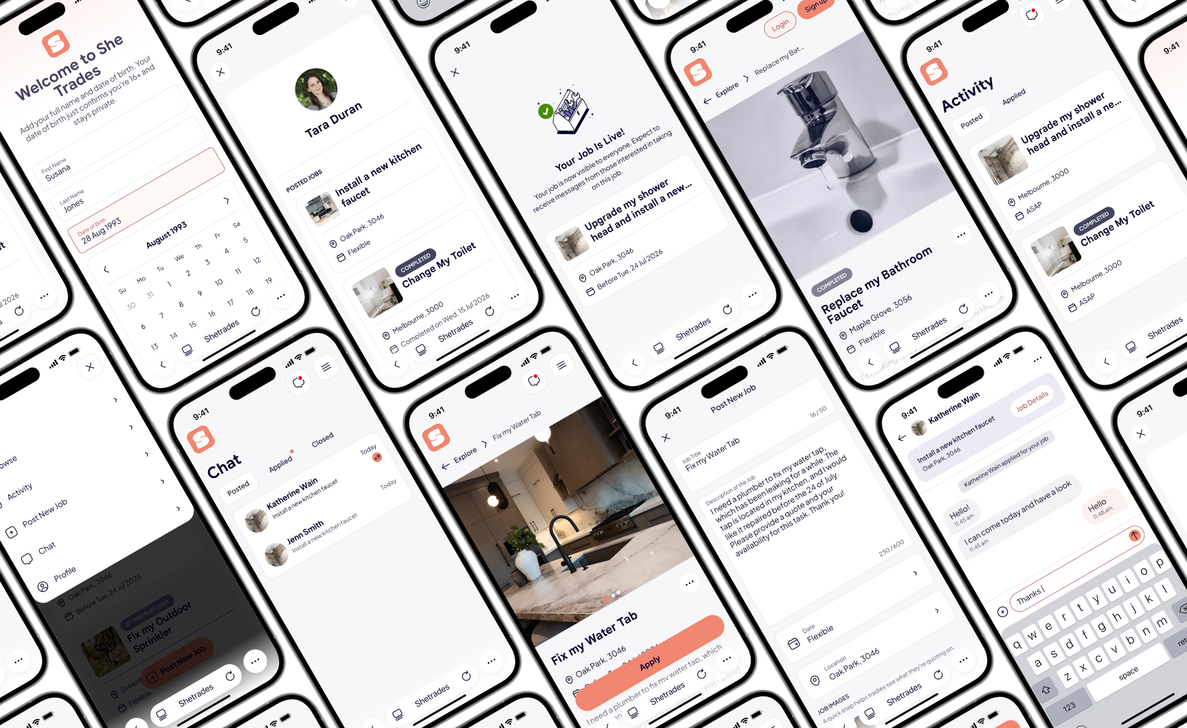
This project taught me how to design from a business strategy document rather than a finished brief.
Working from a Lean Canvas and a goals map meant translating founder-level thinking into concrete interface decisions myself, rather than working off a feature list.
Turning an abstract idea like a "digital badge for social proof" into a concrete, designed engagement mechanic, instead of leaving it as a marketing bullet point.
With real users, I'd want to test how much verification detail people actually need before they trust a listing, and whether the badge mechanic drives repeat use, not just novelty.
This project sharpened my ability to separate business goals from user-facing design problems, and to design for two very different sides of a marketplace at once.
